Temporary UI suggestion: Smart Flight Computer edition

beik

Member
Nov 14, 2025
16
12
Hello there!

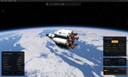
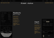
I’ve worked in UX design for more than a decade, and unfortunately I can’t turn off my design brain, so I decided to do some unsolicited design work. Jokes aside, I think the game is visually stunning, but the current UI feels like a mix of excessive skeuomorphism and debug tools. I believe the early-adopter community could benefit from a few improvements: a better temporary system and a UI that makes the game a bit more playable.


My goals with this redesign:
  • Don’t introduce anything overly complex. Keep it simple enough to build in ImGui. (Example: SAS controls are still buttons, I'm not touching the Navball, and icons are from Material symbols)
  • Fix the current “warp to” mess. Make it consistent and easy to find.
  • Fix the SAS control mess. Unify “null rot,” group the most important options, and put advanced controls in a dropdown.
  • Auto-select the best "reference frame" based on the context.
  • Create a strong foundation for the information hierarchy: Global info, Trajectory readout, and Pilot input sections.
  • Highlight (in Global info) the basic principle of rocket launches: you need to balance weight and propellant to have enough dV. It’s obvious to veterans, but it takes time to master the “moar booster!” mindset.
  • Add vital trajectory information without causing information overload: Maybe a smart Flight Computer?
  • Keep the info learning curve approachable where most players start: ascending and trying to reach their first orbit.
  • Make the UI start to make sense whether you’re flying or driving a rover.
  • Create space (in the Flight Computer) for Maneuver, Target, and Docking trajectory info to appear.


I don’t expect any of these ideas to be taken too seriously, and I’m not smart enough to make a mod. But I do think this is a great starting point for discussing UI ideas where newbies and veterans can coexist.


Overview
KSA_UIredesign_Overview.png

Mockup
KSA_UIredesign_Mock.png

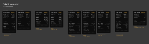
Flight Computer: All possible modes
KSA_UIredesign_FlightComputerModes.png


What do you think? Feel free to remix this!


Peace
 
Upvote 3
Love the thought put into this and the agregation of information feels right; it's mostly "things to know" on the left and "things to do" on the right.

I like the consistency of layout in the Flight Computer as shown in the third imager. One question though: there appears to be a drop-down on the top row for Ascending, Orbiting, Transfer, etc. The yellow text and down arrow indicate "drop down selection" to me. It appears, though, that these values are informational only, based on the condiotions indicated in your notes, correct? That is, you can't actually change this item, can you? Perhaps they should remain in that location and remove the arrow. I'm torn on re-coloring it white, as it is important to know what state you're in.
 
  • Like
Reactions: Benabik and beik
Love the thought put into this and the agregation of information feels right; it's mostly "things to know" on the left and "things to do" on the right.

I like the consistency of layout in the Flight Computer as shown in the third imager. One question though: there appears to be a drop-down on the top row for Ascending, Orbiting, Transfer, etc. The yellow text and down arrow indicate "drop down selection" to me. It appears, though, that these values are informational only, based on the condiotions indicated in your notes, correct? That is, you can't actually change this item, can you? Perhaps they should remain in that location and remove the arrow. I'm torn on re-coloring it white, as it is important to know what state you're in.
Hey, thanks for actually paying attention to the details! The idea is that the orange is an accent color to indicate “active”, and in the Flight Computer it tells what mode was selected (based on the conditions). The dropdown is to be able to override the mode and maybe support custom ones.

But they main idea was to be able to override, I believe you can get funny results if you are doing doing creative constructions like a quad drone.
 
I was checking the mockup again and realized that the lack of alignment in the units was introducing some visual noise. I made a new version... Now it is easier to quickly visually parse the info!

KSA_UIredesign_FlightComputerAlignment.png

The atmospheric density (kg/m³) and location (latlong DMS) fields are a bit tricky to fit in the 3 chars space, so there is a bit of cheating in these :P
 
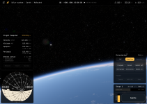
I saw this thread mentioned last week on discord, and I've been playing around with these designs over the last weekend to learn modding & ImGui. I'd love some feedback on some of the liberties I've taken with the originals, and if you're still keen on exploring this further, I'd love to see what you had in mind for next steps.

Here's what I've got so far;

base.png

Game Menu Bar:
Unfortunately the top menu bar seems unmoddable right now. The only thing I can do is to append default ImGui menus in the wrong order (That's how the "View" button ended up re-ordered). If anyone has ideas for addressing this issue I'm all-ears. I could always create a whole new menu bar from scratch, and I think I could hide the old one, but so far I've been trying to make very light touches to the core features to keep the mod resilient to version changes.

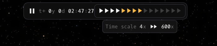
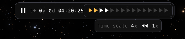
Time Scale Bar:
I've tried to adjust the design as closely as possible given the above limitations. Each play button maps to the specific time scales from the core game, so there are a lot of them. I could remove some of the higher scales maybe?

Until I can figure out how to upload videos, here's a snapshot showing the time scale set at the forth scale (4x), with the mouse hovered over the eigth scale (600x).

1784724736896.png
This one shows the mouse hovered over the second scale (1x) (0.1x is the lowest).
1784727346263.png

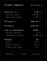
Flight Computer:
This one's coming along nicely, but I need to put more work into it. I'm intending to clean up the units (some of them aren't hooked up to the game yet, and others are just pulling in the default Brutal unit strings; eg. "minutes") and make each line item selectable so players could pick and choose what gets included in each mode.

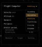
I took a stab at the dropdown. I intend to make an "auto switch" mode (Selecting any mode would disable auto-switching, so there needs to be a way to turn auto-switching back on.

It would be great to see what you had in mind for the Maneuver, Target, and Docking sections.

1784728132076.png1784724835331.png

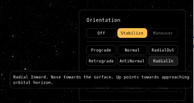
Orientation:
Not much to say here. I'd love to see what you had in mind for the "more", "Toward", "Anti-Vel", "Away" modes.

1784727676256.png

Sequence:
Sequences / stages still seem in flux by thet RW team, but I feel like it's roughly stable enough to proceed with ideas for showing all the vehicle stages at once. I've been working on some ideas as next-steps (different fuel types, multiple stages, stage-type indicators, etc), but let me know if you had something specific in mind.

Engine / Ignite:
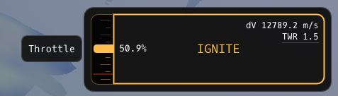
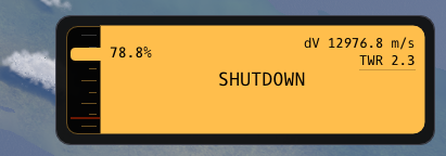
I took some liberties with this one. I felt the throttle bar looked a little too much like a fuel resource, so I gave it another shot by attaching it to the ignite button and giving it more of a gauge-y feel.
If you want to iterate or take another shot at the original designs, there are a few constraints;
  • Enforced minimum throttle (Shown below with the red line)
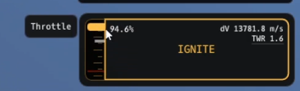
  • KSA's interaction-mode only allows for discrete up/down throttle increments, and dragging the throttle slider moves way too fast for it to keep up. The way I'm handling it is with a second small white bar that indicates the live throttle value. When you drag the slider bar, the white bar follows along to keep up with any changes.
  • Today's game update added another RCS ignite/shutdown button. I haven't incorporated it yet - not sure if that's needed on the primary ignite panel

1784725923783.png1784725902388.png

Little white bar playing catch-up from a lower throttle to the higher one.
1784727514576.png
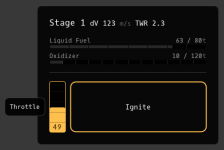
Old throttle gauge as comparison;
1784725977943.png

Nav Ball:

I haven't been able to figure out a way to make this work yet. I tried displaying the existing gauge over a new ImGui window but it ended up too laggy to use. I can create basic shaders, but I don't know if I can make a navball shader. I'll dig into soon to see if I'm capable of pulling out the core nav-ball and rendering it with this UI style of buttons. If I figure out a way I'll update this thread - it's the hero gauge so it would be a shame if there wasn't a method of making it work in this theme.

Other Thoughts:
  • If you feel inclined, I'm open to any very specific critiques / spacing / pixel misalignment / font-heights etc that you have. I'll let you know if/when we hit up against any ImGui limitations. Likewise, if you have larger changes you want to try, let me know.
  • I've used OxygenMono-Regular. Let me know if it works or what other font you'd recommend.
  • ImGui is incredibly flexible, but also has unintuitive hard limits on what's possible. We can push the design further if needed (eg. Throttle gauge), but it's hard to say upfront what can / cannot be done.
  • Making the mod available - I'm still figuring this out. I'll post in here with any progress I make on that front.
  • If I can figure out how to get a video in here I'll post it in a follow-up.
 
Yeah this looks pretty sleek! I like it. Looking forward to more.
 
I saw this thread mentioned last week on discord, and I've been playing around with these designs over the last weekend to learn modding & ImGui. I'd love some feedback on some of the liberties I've taken with the originals, and if you're still keen on exploring this further, I'd love to see what you had in mind for next steps.

Here's what I've got so far;

View attachment 1744

Game Menu Bar:
Unfortunately the top menu bar seems unmoddable right now. The only thing I can do is to append default ImGui menus in the wrong order (That's how the "View" button ended up re-ordered). If anyone has ideas for addressing this issue I'm all-ears. I could always create a whole new menu bar from scratch, and I think I could hide the old one, but so far I've been trying to make very light touches to the core features to keep the mod resilient to version changes.

Time Scale Bar:
I've tried to adjust the design as closely as possible given the above limitations. Each play button maps to the specific time scales from the core game, so there are a lot of them. I could remove some of the higher scales maybe?

Until I can figure out how to upload videos, here's a snapshot showing the time scale set at the forth scale (4x), with the mouse hovered over the eigth scale (600x).

View attachment 1745
This one shows the mouse hovered over the second scale (1x) (0.1x is the lowest).
View attachment 1750

Flight Computer:
This one's coming along nicely, but I need to put more work into it. I'm intending to clean up the units (some of them aren't hooked up to the game yet, and others are just pulling in the default Brutal unit strings; eg. "minutes") and make each line item selectable so players could pick and choose what gets included in each mode.

I took a stab at the dropdown. I intend to make an "auto switch" mode (Selecting any mode would disable auto-switching, so there needs to be a way to turn auto-switching back on.

It would be great to see what you had in mind for the Maneuver, Target, and Docking sections.

View attachment 1753View attachment 1746

Orientation:
Not much to say here. I'd love to see what you had in mind for the "more", "Toward", "Anti-Vel", "Away" modes.

View attachment 1752

Sequence:
Sequences / stages still seem in flux by thet RW team, but I feel like it's roughly stable enough to proceed with ideas for showing all the vehicle stages at once. I've been working on some ideas as next-steps (different fuel types, multiple stages, stage-type indicators, etc), but let me know if you had something specific in mind.

Engine / Ignite:
I took some liberties with this one. I felt the throttle bar looked a little too much like a fuel resource, so I gave it another shot by attaching it to the ignite button and giving it more of a gauge-y feel.
If you want to iterate or take another shot at the original designs, there are a few constraints;
  • Enforced minimum throttle (Shown below with the red line)
  • KSA's interaction-mode only allows for discrete up/down throttle increments, and dragging the throttle slider moves way too fast for it to keep up. The way I'm handling it is with a second small white bar that indicates the live throttle value. When you drag the slider bar, the white bar follows along to keep up with any changes.
  • Today's game update added another RCS ignite/shutdown button. I haven't incorporated it yet - not sure if that's needed on the primary ignite panel

View attachment 1748View attachment 1747

Little white bar playing catch-up from a lower throttle to the higher one.
View attachment 1751
Old throttle gauge as comparison;
View attachment 1749

Nav Ball:

I haven't been able to figure out a way to make this work yet. I tried displaying the existing gauge over a new ImGui window but it ended up too laggy to use. I can create basic shaders, but I don't know if I can make a navball shader. I'll dig into soon to see if I'm capable of pulling out the core nav-ball and rendering it with this UI style of buttons. If I figure out a way I'll update this thread - it's the hero gauge so it would be a shame if there wasn't a method of making it work in this theme.

Other Thoughts:
  • If you feel inclined, I'm open to any very specific critiques / spacing / pixel misalignment / font-heights etc that you have. I'll let you know if/when we hit up against any ImGui limitations. Likewise, if you have larger changes you want to try, let me know.
  • I've used OxygenMono-Regular. Let me know if it works or what other font you'd recommend.
  • ImGui is incredibly flexible, but also has unintuitive hard limits on what's possible. We can push the design further if needed (eg. Throttle gauge), but it's hard to say upfront what can / cannot be done.
  • Making the mod available - I'm still figuring this out. I'll post in here with any progress I make on that front.
  • If I can figure out how to get a video in here I'll post it in a follow-up.
Wow, this is amazing!

I will reach you to see how we can collaborate closer on this, but so far, great job!

I believe there is still a lot of room for flexibility on my initial idea, but the core of it is “separation of concerns”. The split between what is trajectory and what is performance data, what immediately info and what is long term planning.