Hello there!
I’ve worked in UX design for more than a decade, and unfortunately I can’t turn off my design brain, so I decided to do some unsolicited design work. Jokes aside, I think the game is visually stunning, but the current UI feels like a mix of excessive skeuomorphism and debug tools. I believe the early-adopter community could benefit from a few improvements: a better temporary system and a UI that makes the game a bit more playable.
My goals with this redesign:
I don’t expect any of these ideas to be taken too seriously, and I’m not smart enough to make a mod. But I do think this is a great starting point for discussing UI ideas where newbies and veterans can coexist.
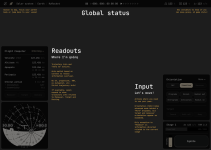
Overview

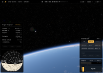
Mockup

Flight Computer: All possible modes

What do you think? Feel free to remix this!
Peace
I’ve worked in UX design for more than a decade, and unfortunately I can’t turn off my design brain, so I decided to do some unsolicited design work. Jokes aside, I think the game is visually stunning, but the current UI feels like a mix of excessive skeuomorphism and debug tools. I believe the early-adopter community could benefit from a few improvements: a better temporary system and a UI that makes the game a bit more playable.
My goals with this redesign:
- Don’t introduce anything overly complex. Keep it simple enough to build in ImGui. (Example: SAS controls are still buttons, I'm not touching the Navball, and icons are from Material symbols)
- Fix the current “warp to” mess. Make it consistent and easy to find.
- Fix the SAS control mess. Unify “null rot,” group the most important options, and put advanced controls in a dropdown.
- Auto-select the best "reference frame" based on the context.
- Create a strong foundation for the information hierarchy: Global info, Trajectory readout, and Pilot input sections.
- Highlight (in Global info) the basic principle of rocket launches: you need to balance weight and propellant to have enough dV. It’s obvious to veterans, but it takes time to master the “moar booster!” mindset.
- Add vital trajectory information without causing information overload: Maybe a smart Flight Computer?
- Keep the info learning curve approachable where most players start: ascending and trying to reach their first orbit.
- Make the UI start to make sense whether you’re flying or driving a rover.
- Create space (in the Flight Computer) for Maneuver, Target, and Docking trajectory info to appear.
I don’t expect any of these ideas to be taken too seriously, and I’m not smart enough to make a mod. But I do think this is a great starting point for discussing UI ideas where newbies and veterans can coexist.
Overview

Mockup

Flight Computer: All possible modes

What do you think? Feel free to remix this!
Peace
Upvote
1

