Game Menu Bar:
Unfortunately the top menu bar seems unmoddable right now. The only thing I can do is to append default ImGui menus in the wrong order (That's how the "View" button ended up re-ordered). If anyone has ideas for addressing this issue I'm all-ears. I could always create a whole new menu bar from scratch, and I think I could hide the old one, but so far I've been trying to make very light touches to the core features to keep the mod resilient to version changes.
From my point of view, the current game menu is more of a developer menu and shouldn't be considered part of the game HUD. We should implement our own top bar with more game-oriented information.
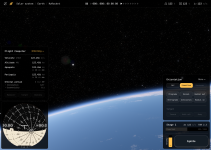
As for the aesthetics of the top bar, I had in mind either a transparent, full-width background or more of a floating-pill style (similar to what you implemented for the time scale).
Time Scale Bar:
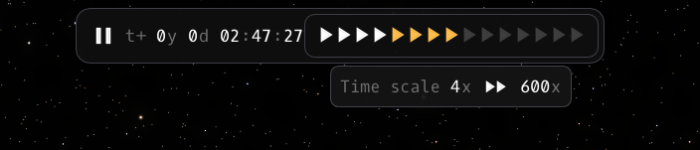
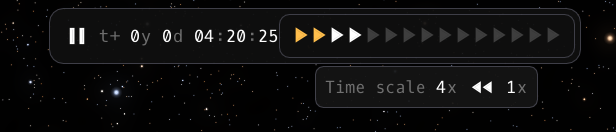
I've tried to adjust the design as closely as possible given the above limitations. Each play button maps to the specific time scales from the core game, so there are a lot of them. I could remove some of the higher scales maybe?
Here, we need to balance "what is useful for the player" and "what is possible within the engine." Ideally, we should avoid adding new abstractions between the engine and the UI, but in this case, maybe we should limit the options a bit.
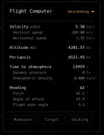
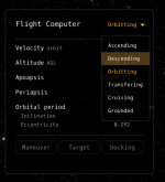
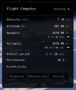
I took a stab at the dropdown. I intend to make an "auto switch" mode (Selecting any mode would disable auto-switching, so there needs to be a way to turn auto-switching back on.
From what I remember, the dropdown would look something like this:
[Selector list] (with active state feedback)
- Mode
- Mode
- Mode
- Mode
---
[Checkbox list] (uncheck if select any selector option above)
[ ] Auto-Switch
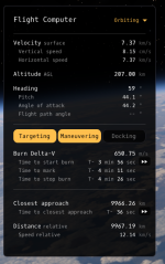
It would be great to see what you had in mind for the Maneuver, Target, and Docking sections.
I never went into the UI details for these, but the rationale is that they are mostly trajectory-related information, so we would stack another list of data below. They would behave similarly to a tabbed group, where only one can be active at a time.
(I can work on these UI designs if you'd like to tackle them too!)
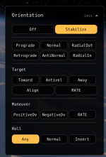
Orientation:
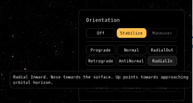
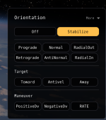
Not much to say here. I'd love to see what you had in mind for the "more", "Toward", "Anti-Vel", "Away" modes.
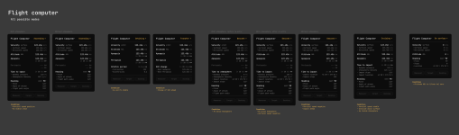
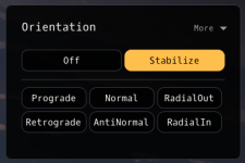
The KSA attitude model has way more options than what we had in KSP, and I'm not entirely sure that the player actually needs all of them. My idea here was to display them more intelligently: start with the most important and useful ones (Stabilize and Maneuver), then the basic ones (Prograde, Retrograde, etc.), followed by contextual ones (Target, etc.).
The advanced and more complicated options would be moved into "More," so expert users can still find them.
Another interesting discussion around this component is whether the mode (orbiting/flying) should affect it. If so, does it make sense for the mode selection to belong to another component? The implication is that it makes the flight computer higher in the information hierarchy (which is fine if the player understands it), or alternatively, that we should move mode selection to the top bar.
As a final note, I designed it in a very button-heavy and verbose way to keep things simple, but the ideal solution would be something closer to what KSP2 did, a simple 3D dart that players can easily associate with trajectory direction.
Sequence:
Sequences / stages still seem in flux by thet RW team, but I feel like it's roughly stable enough to proceed with ideas for showing all the vehicle stages at once. I've been working on some ideas as next-steps (different fuel types, multiple stages, stage-type indicators, etc), but let me know if you had something specific in mind.
I still need to check the latest game updates, but my initial thoughts were:
- A side rail that toggles the stage window above the Ignite panel.
- A dropdown selector in the header of the stage window.
One hard rule I had in mind while designing this part is that it's very tempting to mix trajectory or "time-to" information into the stage section, but my rule is that we should delegate all time and trajectory information to the left side of the HUD and keep the right side focused on performance, power, and resources.
I still struggled a bit with the "time until end of stage burn," but maintaining a clear separation of concerns was more important to me.
Engine / Ignite:
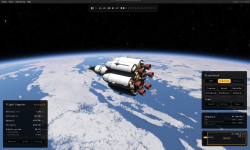
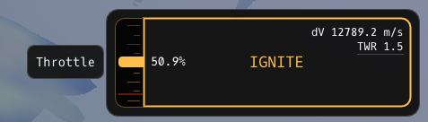
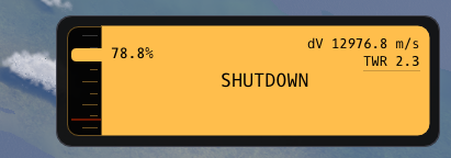
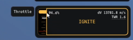
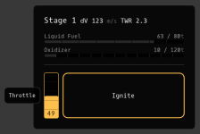
I took some liberties with this one. I felt the throttle bar looked a little too much like a fuel resource, so I gave it another shot by attaching it to the ignite button and giving it more of a gauge-y feel.
If you want to iterate or take another shot at the original designs, there are a few constraints;
- Enforced minimum throttle (Shown below with the red line)
- KSA's interaction-mode only allows for discrete up/down throttle increments, and dragging the throttle slider moves way too fast for it to keep up. The way I'm handling it is with a second small white bar that indicates the live throttle value. When you drag the slider bar, the white bar follows along to keep up with any changes.
- Today's game update added another RCS ignite/shutdown button. I haven't incorporated it yet - not sure if that's needed on the primary ignite panel
I agree, the initial design wasn't great, and you actually solved some UX issues. I'm not 100% sold on the aesthetics, but I'm much more focused on the information architecture than the art direction, so it works for me. (This is also one of the components where we can take a bit more artistic liberty and lean slightly more into skeuomorphism.)
I still need to check what the RCS ignite/shutdown button actually does. Is it similar to the KSP RCS toggle? RCS controls fit naturally on the right side of the HUD model, so we can integrate them into either the Ignite panel or the Orientation panel. I can work on the design if you plan to tackle this.
Nav Ball:
I haven't been able to figure out a way to make this work yet. I tried displaying the existing gauge over a new ImGui window but it ended up too laggy to use. I can create basic shaders, but I don't know if I can make a navball shader. I'll dig into soon to see if I'm capable of pulling out the core nav-ball and rendering it with this UI style of buttons. If I figure out a way I'll update this thread - it's the hero gauge so it would be a shame if there wasn't a method of making it work in this theme.
This one looks quite difficult to deal with, which is why I tried to avoid restyling or changing the Nav Ball itself. The only change I would make is delegating the frame-of-reference selection to the Flight Pilot dropdown so that the Nav Ball becomes read-only.
Another idea I had was to provide alternatives to the Nav Ball depending on the current mode. The Nav Ball is great for launching, landing, orbiting orientation, but not particularly useful for flying, roving, or walking. This would be a much larger project, but if you're interested, I can draft some ideas for it as well.
Other Thoughts:
- If you feel inclined, I'm open to any very specific critiques / spacing / pixel misalignment / font-heights etc that you have. I'll let you know if/when we hit up against any ImGui limitations. Likewise, if you have larger changes you want to try, let me know.
- I've used OxygenMono-Regular. Let me know if it works or what other font you'd recommend.
- ImGui is incredibly flexible, but also has unintuitive hard limits on what's possible. We can push the design further if needed (eg. Throttle gauge), but it's hard to say upfront what can / cannot be done.
- Making the mod available - I'm still figuring this out. I'll post in here with any progress I make on that front.
- If I can figure out how to get a video in here I'll post it in a follow-up.
I like what I see, and my approach has been to focus on the information and input challenges rather than the art direction. The only UI aspect I feel is being affected somewhat is the spacing and alignment, since they do a lot of the heavy lifting in communicating what elements belong together.
The alignment of the sub-data entries feels a bit off. The divider doesn't line up properly with the units, and some of the spacing between dividers and panels could use adjustment.
The font is fine, and the game's font (JetBrains?) works well too.
---
Let me know if I missed anything or if any of my answers were too vague